UX Writing Case Study: Canada Life
Project Overview
This case study is a personal initiative that originated from my role at Canada Life. The main focus is on identifying pain points when submitting drug claims and finding a solution that aligns with Canada’s life brand and operations. As a customer service representative, I often hear about the challenges clients face on a daily basis. While many of these issues relate to claim assessments, a significant number also involve difficulties with website navigation, the site's user experience (UX), and how coverage and claim details are presented. In this case study, I did both quantitative and qualitative research to solidify the pain points. Through my research I pinpoint where users struggle the most and revise that part of the process while keeping considerations of how the company operates in the back-end.
Project Duration
January 2025 - March 2025
Roles
UX Writer/Designer
Canada Life representative
Quantifying the Problem
Identifying the issue with claim submissions was straightforward. As mentioned earlier, being the primary point of contact for clients allowed me to hear firsthand about the challenges they faced on a daily basis. To assess whether it was a widespread issue, I tracked the number of calls I received each day related to drug claim submissions. I consistently received at least one call per day about it. To gather a larger sample size, I reached out to colleagues in my group work chats and was able to get three other drug-trained colleagues to track their calls related to drug claim submissions. This was the most challenging part, as it required follow-ups to ensure I received their results. Ultimately, their findings aligned with mine. To understand the size of the issue…

Pain Points
Since the issue with drug claim submissions was apparent. I wanted to identify the pain points to understand why there was such a struggle with it. I used working as a customer service rep to my advantage. My advantage was being able to listen to what the pain points were first hand and what I discovered was:
1. Current process isn’t intuitive
A common issue clients faced was submitting claims was the DIN (drug identification number) did not work all the time. Most of the type, patients had official pharmacy receipts which was listed as one of the options but none of the other selections matched what they had.
2. Alternative solution required more work
In addition to the alternative process not being intuitive, it also introduced an extra step for successful claim submission: clients had to include a claim form. This created two issues. First, it required clients to be somewhat tech-savvy, as they needed to use another application to complete the form. Second, it made submitting claims through the mobile app much more challenging, since the form was also required.


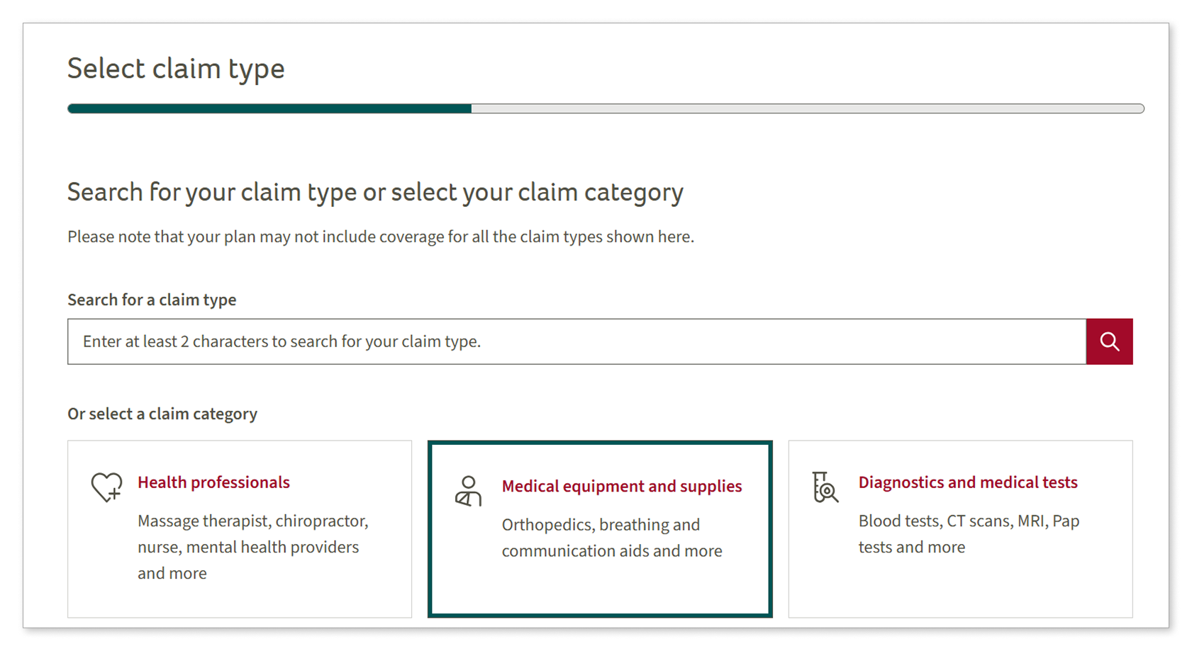
Current Process

Usability Testing
To gain a deeper understanding of the issue, I observed how users interacted with the site when submitting a drug claim. I conducted usability tests with four tech-savvy individuals I knew who were also insured by Canada Life. I provided them with two mock receipts with real-life examples and asked them to share their screen while attempting to submit a claim. Questions I asked included:
Screening Questions/Pre-test
How often do you use your Canada Life insurance?
When you do submit claims, do you use the website or mobile app?
Can you share your experience with submitting claims?
Do you feel experienced or comfortable with submitting claims?
During the test
Are you familiar with the products are?
Which option do you think this item belongs in?
Are there questions during the submission you need clarification on?
Did you feel confident with your selection?
Were there any parts that you felt troubled or struggled with?
The Receipts
First Receipt

Test Findings
First Test
Users spent an average of 10 minutes submitting their first receipt, mostly on the “Add an expense” step. Before asking them to start, I explained that the item in the receipt is a diabetic supply and what it’s used for.
After the DIN didn’t work, they explored other options, with two users selecting “A receipt for diabetic supplies” as a potential fit. When they reached the “Type of diabetic supplies” question, I explained each item in the list and let them decide if any seemed appropriate. They advised they would’ve submitted the receipt in this section but neither were confident in their selection.
As a result, the first receipt had a 50% success rate. One user selected “A receipt from doctor’s office or clinic” as the type, while another returned to the category section and chose “Medical equipment and supplies”—both following customer service suggestions.


Results

Second Test
Users spent an average of 8 minutes submitting the second receipt. Again, most of the time was spent on the “Add an expense” step, but with a lower success rate. Only one user selected “Receipt from a doctor’s office or clinic”, the same user who did so previously. Others gave up, dropping the success rate to 25%. One user considered submitting in “Other claims” but abandoned it after seeing a disclaimer—despite it being a recommended option by customer service reps.
Post-test
Do you think there were any sections that could’ve been communicated better?
Do you feel like the overall process was intuitive?
What did you think of the overall process?
Second Receipt

It was conclusive that the “Add an Expense” page was the problem. Users chose what they thought was the obvious choice in the usability test. They were given a pharmacy receipt and a DIN number to enter but that option didn’t work. When asked to think of alternative ways of submitting the claim, no one was confident in their selection. All users shared it was harder to submit the receipt than expected.
Working Towards a Solutions
Before developing a solution, I created two contrasting personas to better understand the target users. The first represented the older, less tech-savvy users my colleagues and I frequently assisted. The second, also based on my findings, reflected younger, more tech-savvy users with a "submit now, deal with it later" mindset—similar to those in my usability test.


Brainstorming
Since users struggled most with the “Add an expense” step, I focused my brainstorming there. I explored changes like adjusting “Receipt type” options and making the DIN optional. Although what could be altered felt limited, my solution was influenced by back-end processing, as drug claims can be automated if specific info is provided—otherwise, they require slower manual handling.

Final Decision
I decided to update the form selections on “Receipt type”. Since any of the current selections can have a DIN, it was unfair for only one to include it. While receipts with a non-working or missing DIN require manual processing, valid DINs enable automation. Differentiating this was crucial, as an earlier screen already confirms the receipt type—repeating the question was unnecessary.

What It Looks Like
I reduced the form options from three to two, improving flexibility and reducing user confusion. As shown in my usability testing, the DINs for the items didn’t work, leading users to search the site or potentially contacting support. I also followed Canada’s style guide and made the options conversational and included most of the same wording but making sure it maintains easy comprehension.

What It Fixes
This solution addresses both pain points. These changes make submiting claims more intuitive since the alternative is presented where it is needed and makes it easier for users as well being more universal different types of receipt and invoices. It indirectly makes submitting on the mobile app easier as well because as mentioned earlier in the case study, users would have to go through the hassle of filling out a claim form on-top of finding the alternative spot.
What about the option “A receipt for diabetic supplies”?
Deciding where to keep it or remove it was part of my brainstorming. UItimately, removing it would allow more flexibility. Receipts for diabetic supplies such as lancets and strips may or may not contain DIN numbers. The revised receipt type option allows for both scenarios but clients can always submit it in “Medical equipment and supplies” as an alternative.
